The context
I worked on a new Workforce Benefits line of business at a large U.S. insurance company. The division was stood up in under a year by an eight-person UX team, in collaboration with PricewaterhouseCoopers, the external delivery agency.
We started with personas because the experience had several distinct audiences: employee, employee dependent, employer, financial professional, and broker. The persona work helped define which portals were needed, the interactions each would need, and the systems that would have to participate.
I owned the employee portal. Other teammates focused on the portals for the other audiences.
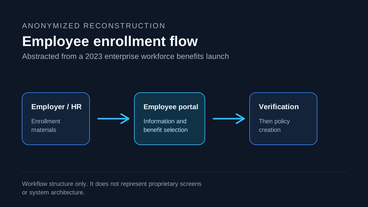
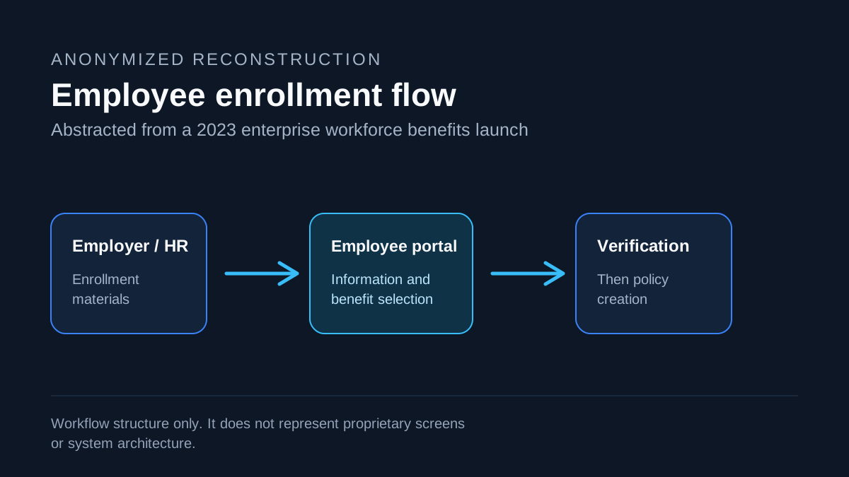
Abstract reconstruction. This shows workflow structure, not proprietary UI or system architecture.
The employee job to be done
An employee received enrollment materials from an employer or HR. From there, they needed to sign in, select benefits, make changes, file claims, view coverage information, and access cards.
The primary onboarding flow collected the employee’s information, sent it for verification, and then supported policy creation. The work had to make a consequential, unfamiliar process understandable without exposing implementation complexity to the employee.
A delivery constraint shaped the design
The intended UI was clean and crisp, built around the internal design tokens and component system. The implementation system selected by the external delivery team could not conform to those components as expected, despite earlier assurances that it could.
I was the only technical member of the UX team. Where the platform allowed it, I supplied design tokens along with CSS and JavaScript that the PwC team could use. That helped translate the internal design system into something buildable. In other places, the platform had no flexibility, and the experience had to be redesigned within its constraints.
The lesson was practical: design-system fidelity is not a brand-detail problem. It changes what interaction patterns can survive implementation.
Research that changed the flow
I planned and conducted remote prototype sessions with brokers and people who had recently enrolled in insurance, using Zoom and Hotjar. Sessions were short, task-based conversations of about five minutes. We asked participants to complete tasks or explain what they expected, then reviewed the recordings to see where the UI did not meet those expectations.
One clear finding was in the policy-information selection flow. Participants could not find parts of the information they needed. We relabeled and repositioned those elements to make them easier to locate and select, then brought the findings back to the team and key stakeholders.
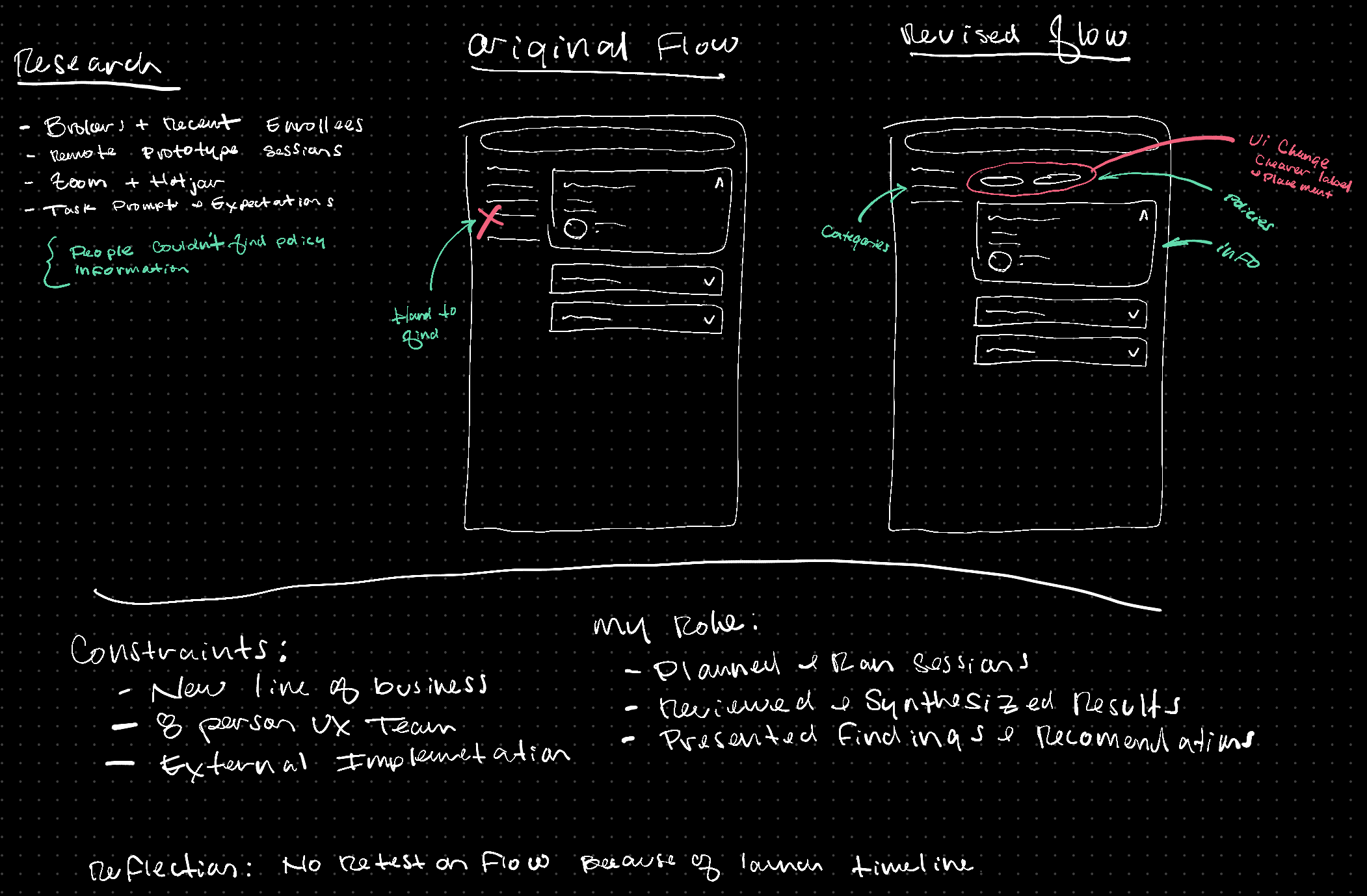
Working sketch reconstructed from the research finding and resulting design decision. It is an abstract representation, not proprietary UI.
We did not have time to re-test the revised flow before launch. Given more time, that is the first validation step I would add.
Outcome and reflection
The employee portal launched around month nine of the division effort, and internal stakeholders were happy with the launch. I had already moved to another project by then, so I do not claim external adoption, satisfaction, or business outcomes that I cannot substantiate.
The project reinforced a pattern that has carried into my design-engineering work: start with the people and workflows, but stay close enough to implementation that design decisions can survive the systems that have to deliver them.