The problem
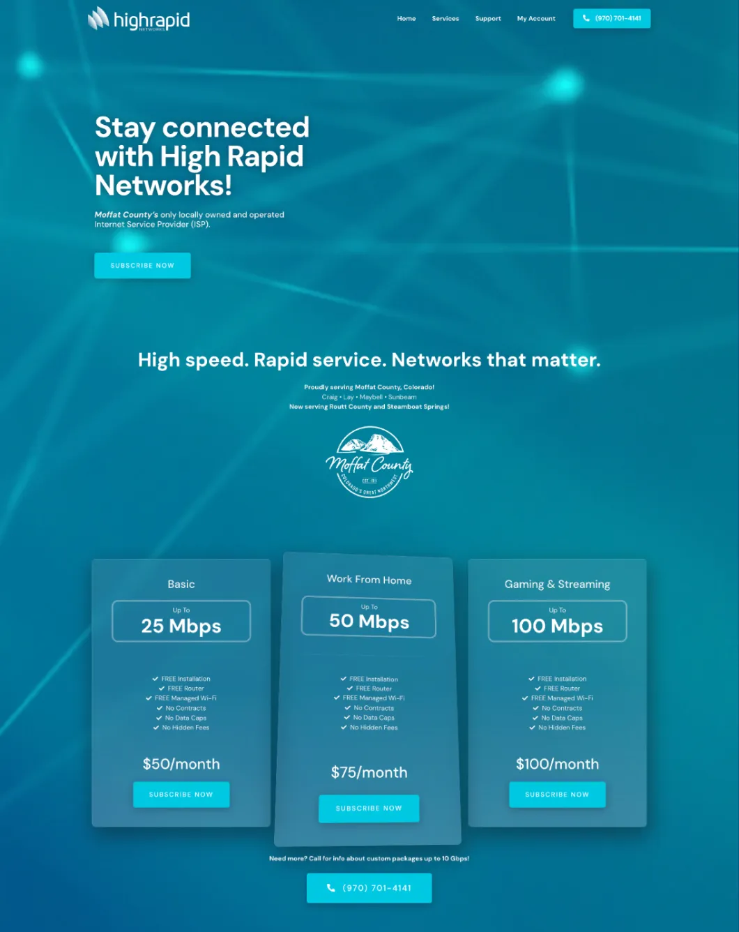
High Rapid Networks had a site built in 2006. It offered a sign-up form, but little help understanding the service before choosing it. The company had three tiers, presented in a single column without a meaningful way to compare them.
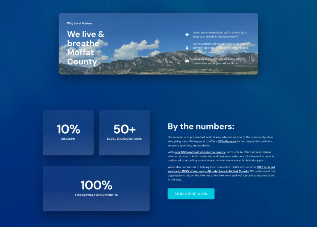
The redesign needed to do two things at once: make the product understandable enough to choose, and show that the ISP was part of the communities it served rather than a distant utility company.
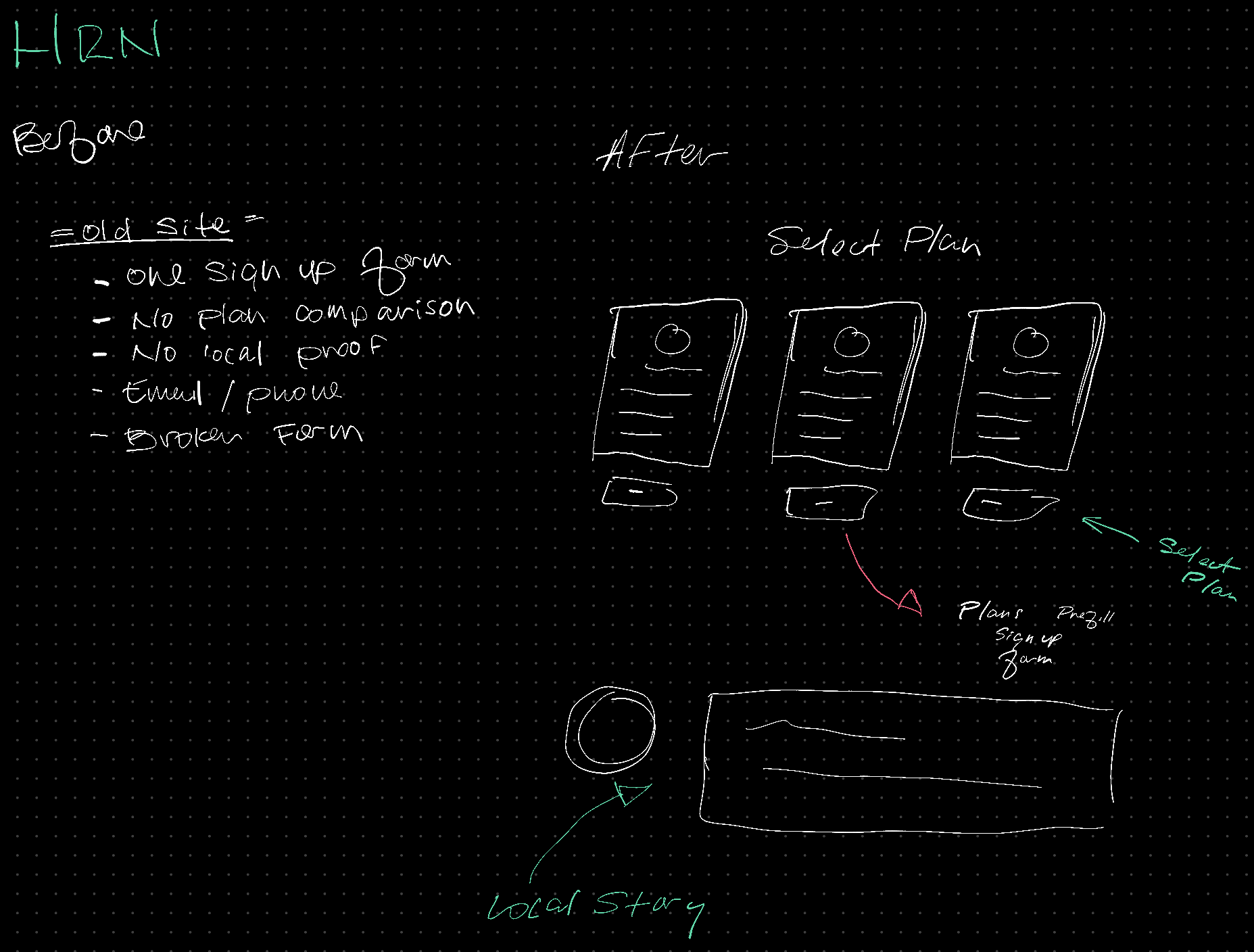
Reconstructed information-architecture comparison. It shows the structure and intent of the change, not archival production UI.
Make the choice clear
I owned the new High Rapid Networks experience end to end: brand, strategy, design, and implementation.
The core product change was a pricing page that put the three tiers into a straightforward comparison table. Each plan had a clear path into sign-up, and the selected plan was prefilled into the form. Customers could make the decision once instead of having to interpret the differences, begin a form, and repeat it.
Show the people behind the network
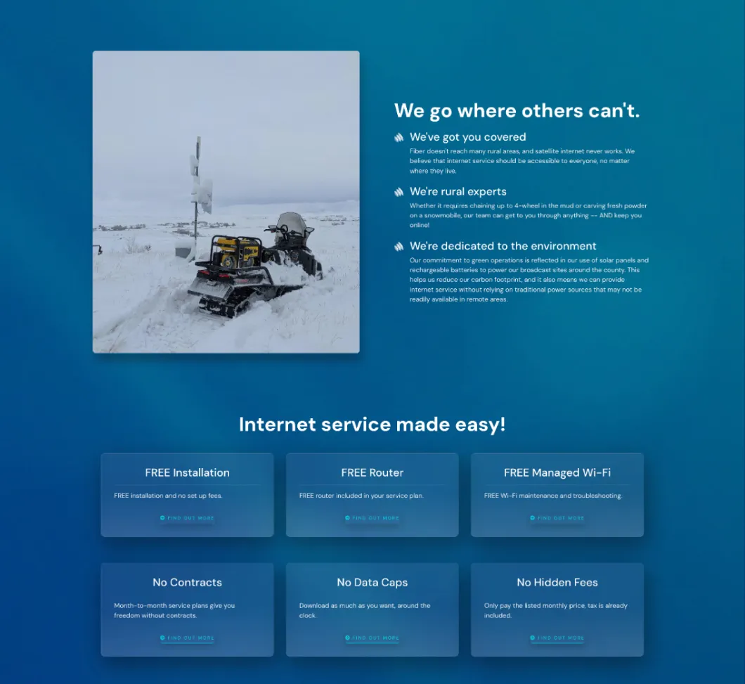
The brand work was grounded in real evidence of local work. The site told the stories of High Rapid Networks’ actual network engineer and installer, with real county job-site photos, including snowmobile access for tower and network-infrastructure installation.
This was not decorative local flavor. It answered a trust question: who is responsible for the connection when the work is difficult and the geography is real?
Pair the site with the acquisition path
The site was one part of a larger acquisition effort. A direct-mail campaign went to every household in Craig, Lay, and Maybell. The mailers offered two paths: the redesigned website’s sign-up flow and a phone route for people who preferred to speak with someone directly.
That pairing mattered. The online experience made services comparable and sign-up easier; the phone route respected a local preference for direct human contact.
Outcome and reflection
Over the year after launch, the subscriber base grew from roughly 400 to between 900 and 1,200. The redesign and direct-mail campaign were both part of that period, so I do not attribute the growth to the website alone.
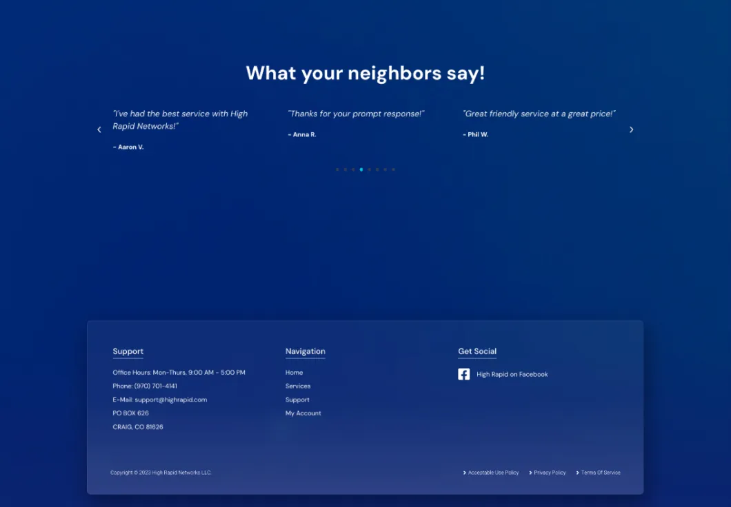
I did not receive direct post-launch customer feedback, so I do not claim satisfaction data. The enduring lesson is simpler: a conversion flow works better when it helps people understand the product and gives them the communication path they actually prefer.
Related reading: What a Rural ISP Taught Me About Design Constraints