The problem
A B2B ISP support company that needed to look established from day one.
Cydrion was a natural extension of the High Rapid Networks ecosystem. A network engineer who had been managing ISP infrastructure wanted to scale his expertise to other wireless ISPs. Same industry, different audience: B2B support instead of consumer internet.
The company was brand new. No logo, no website, no market presence, no precedent. Every decision was a precedent. The audience was other WISP operators. Technical buyers who need to trust you with their network operations. They are skeptical of fluff. They want to know you understand their business.
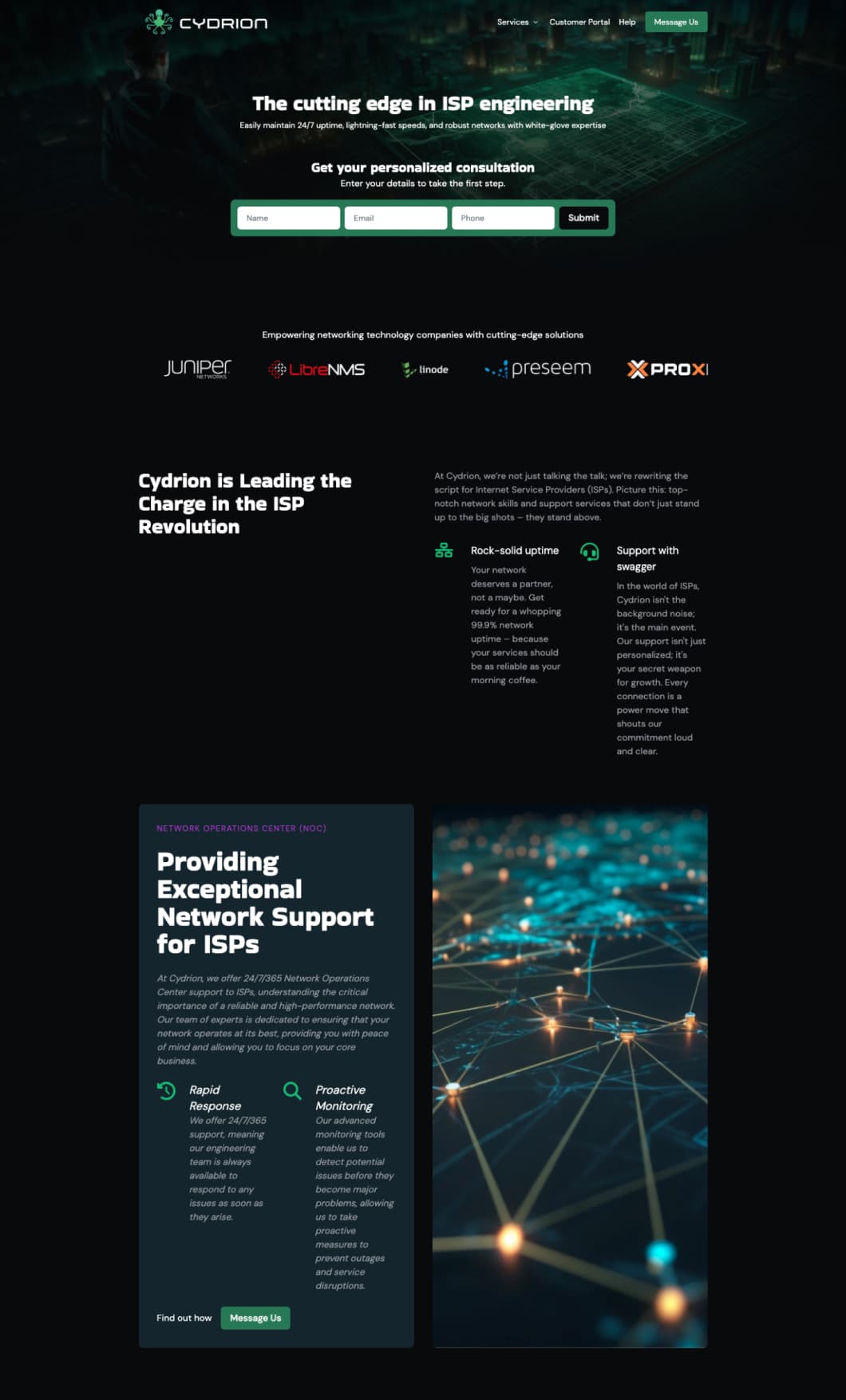
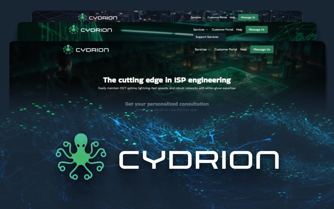
The brand was built around a stealth military operation aesthetic.
Black background. Neon cyan accent. Clean, technical, no-nonsense. The visual language says: "We are your behind-the-scenes network engineering team backed by military precision."
The logo came from a bundle of Ethernet cables that looked like an octopus. A tangle of cables that become one organized system. That image became the Cydrion octopus. The mascot of a covert network operations team working silently in the background.
Everything else was designed to reinforce that language. Low-light, high-contrast, terminal-inspired. A company that doesn't need to shout because their work speaks for itself.
What I did
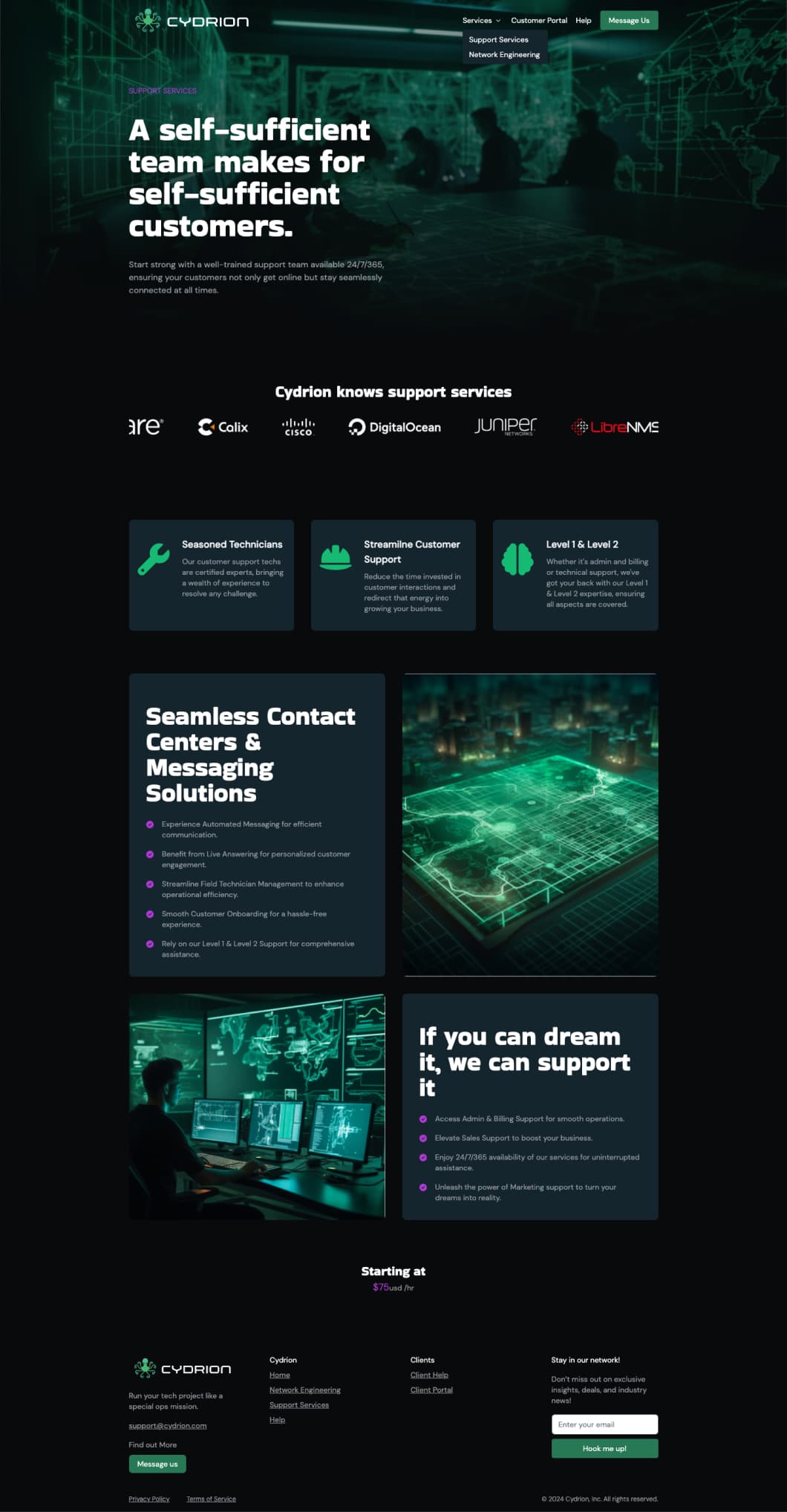
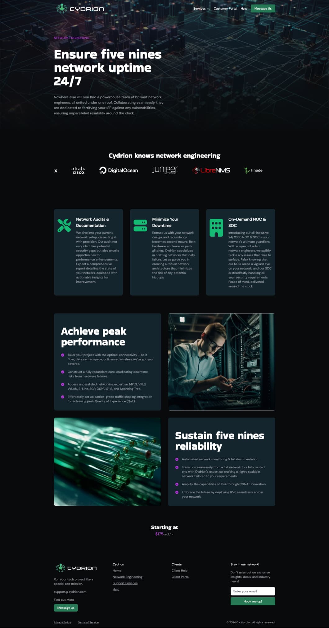
Custom icons that prove we understand the domain.
Network monitoring. Network topologies. Support workflows. These are not concepts you find in big box icon packs. I built a custom icon set that translates technical ISP operations into visual language. Every icon says "we have been inside your operation." Generic icons would have broken the trust we were building.
The octopus reappears throughout the design. As a watermark. As a detail in the hero. As a quiet signal that there is organization underneath the complexity.
Performance targets were set before a line of code was written.
92% accessibility score. 0.6 second load time. Every component was built to those thresholds, not optimized afterward. This was one of my first Next.js projects, and the choice of framework was deliberate. Static page generation meant no database queries, no server-side processing, and no attack surface.
The analytics told the story. After launch, we watched attack attempts hit the infrastructure repeatedly. Next.js static pages had nothing to attack. No plugins to exploit. No admin panels to brute force. The same security philosophy as the Art Healing Hearts rebuild: if there's nothing to hack, you don't get hacked.
Trust signals for a technical audience.
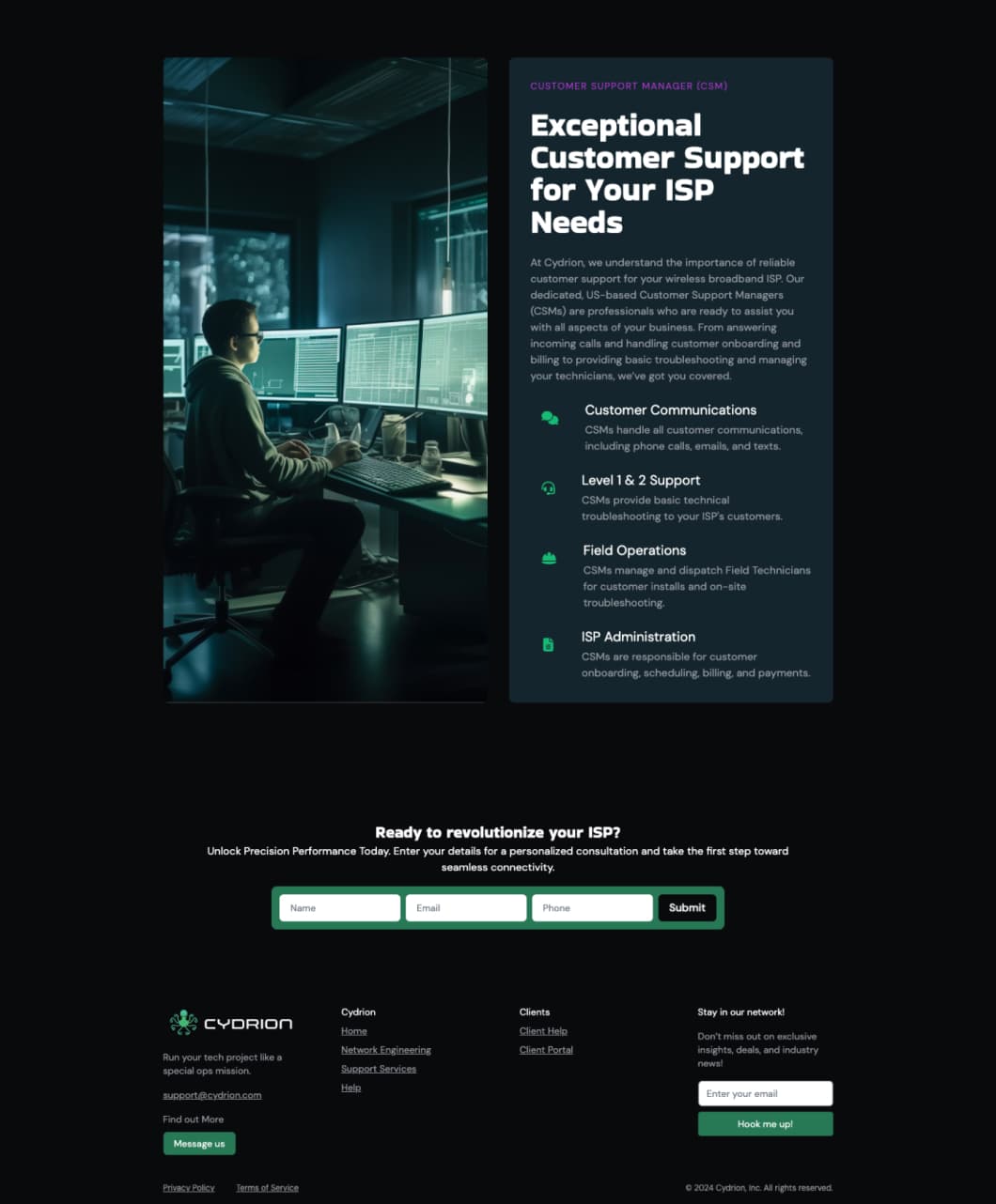
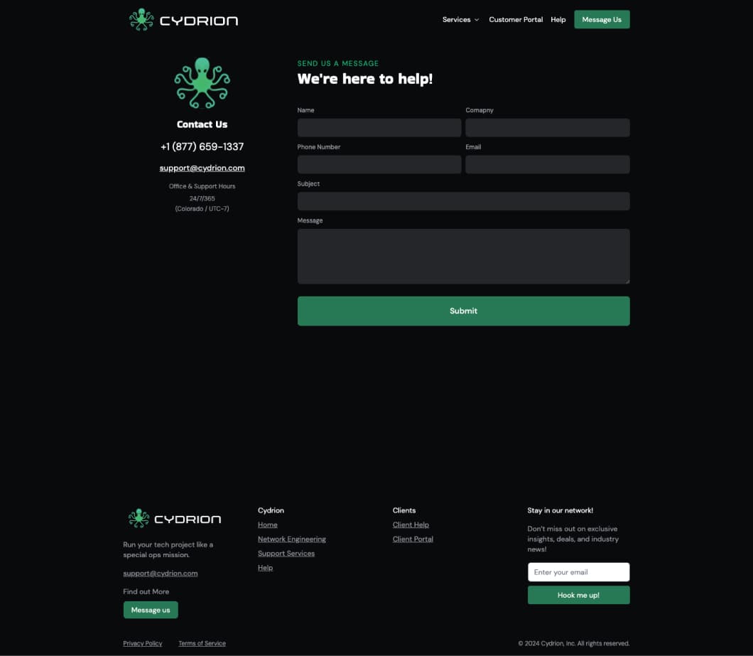
Partner logos from the ISP ecosystem: Calix, Cisco, Juniper, Proxmox, Splynx. A 99.9% uptime guarantee front and center. A tagline that landed: "Support with Swagger." The military background language spoke directly to the WISP operator audience, because many of them come from the same background.
Stripe was integrated for billing. The signup flow connected directly to their service pipeline. The site was the front door for a complete B2B support operation.
The result
The site performed. The business didn't make it for reasons outside the website.
The people who did sign up through the site worked well. The brand was right. The conversion flow was right. The site held up under attack attempts, loaded instantly, and communicated exactly what Cydrion needed to communicate.
The company went out of business for reasons that had nothing to do with the website. They didn't want to run marketing. They went to a couple of trade shows, signed some customers, but the operation didn't sustain.
The case study is about the design and engineering work. A complete brand identity built from nothing. Custom icons for a domain that has none. A security-first architecture that stopped attacks before they started. An octopus born from a tangle of Ethernet cables. That work stands on its own.