A website that blocked the people it needed to serve
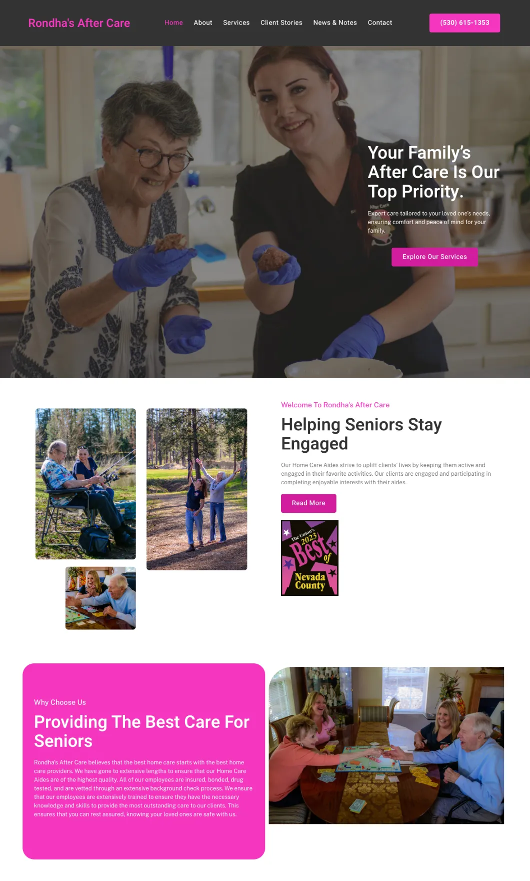
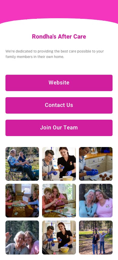
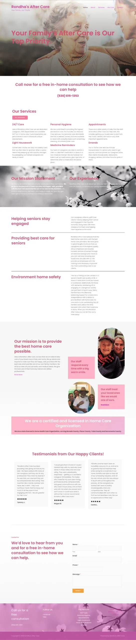
Rhonda’s Aftercare needed its website to support two equally important paths: people seeking care and people applying for jobs. The existing site made both difficult. Its navigation was broken, it was not mobile friendly, and its colors were hard for the organization’s primarily older audience to read.
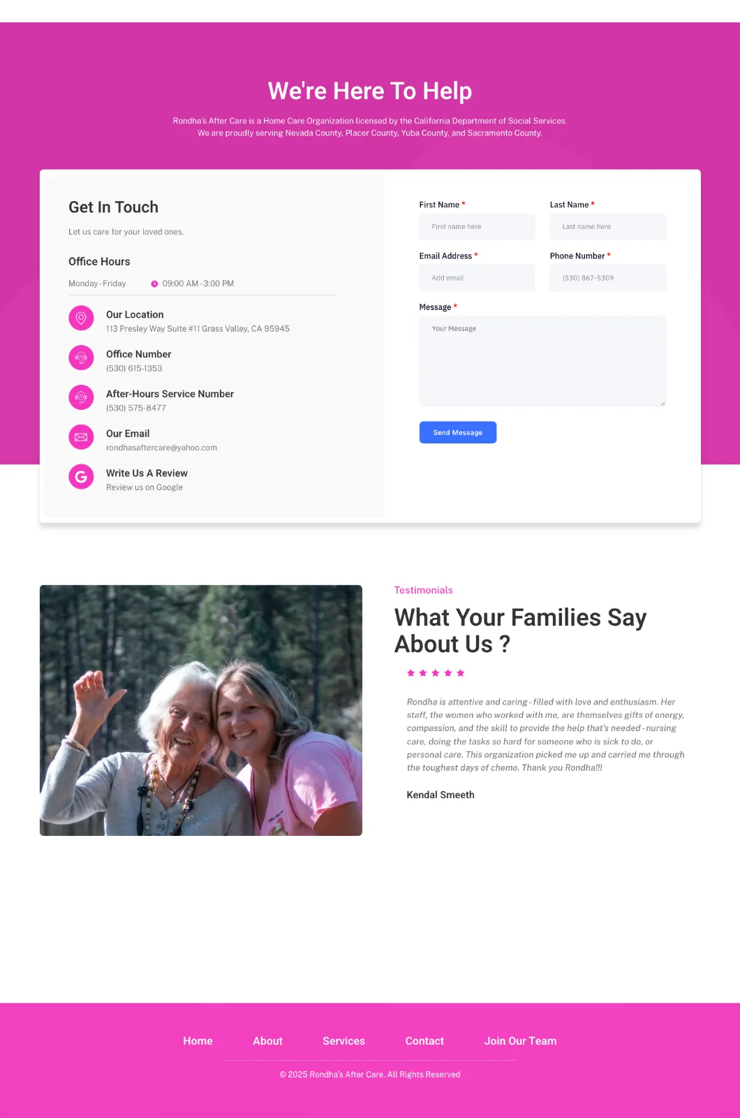
Email and phone were available, but the website’s contact form was broken. That left no dependable, direct way for a visitor to reach the organization from the site itself.
Rebuild the journeys around clarity and contact
I owned the redesign and implementation end to end. The client supplied its photography remotely from Grass Valley while I worked from Southern California.
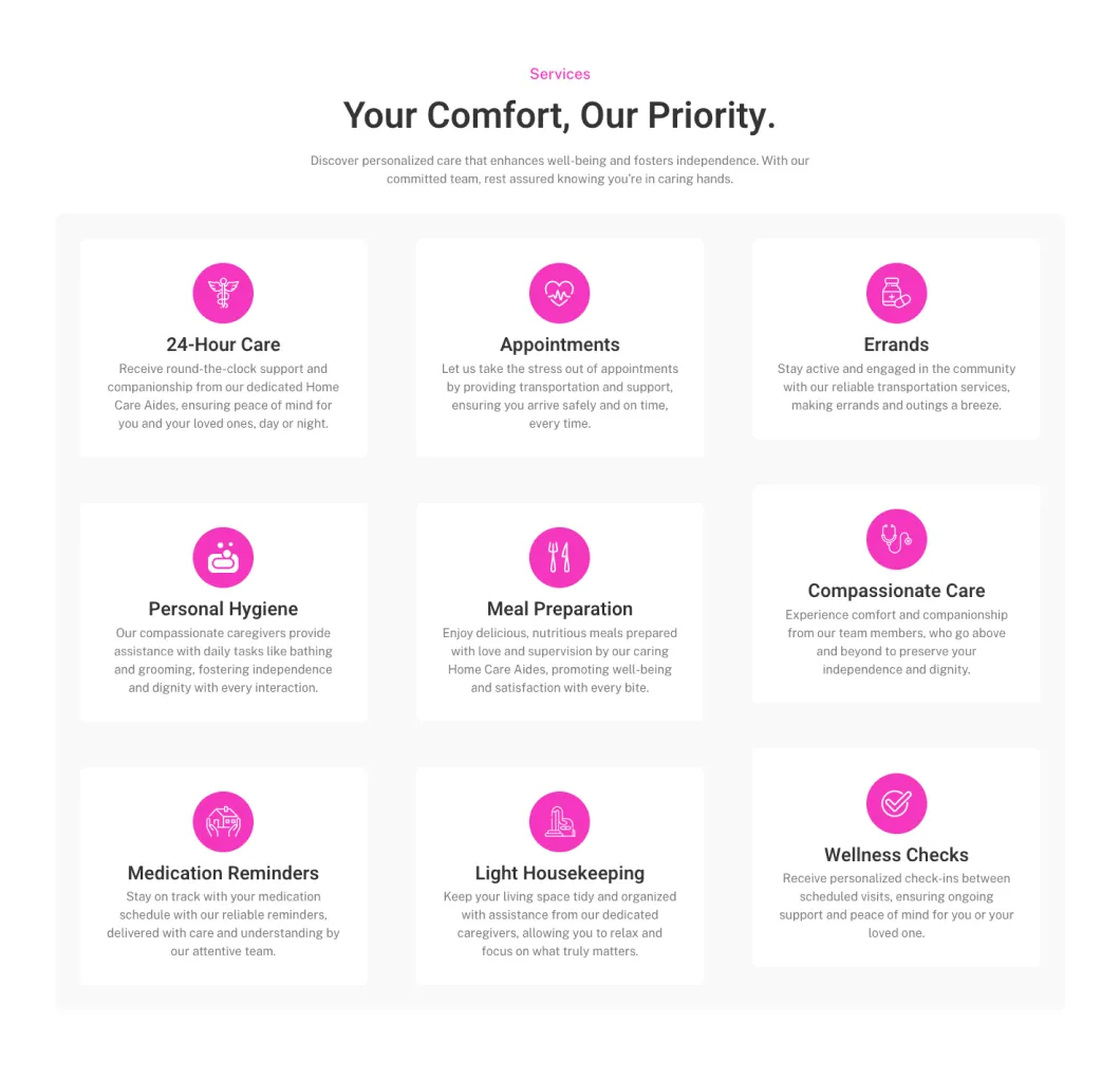
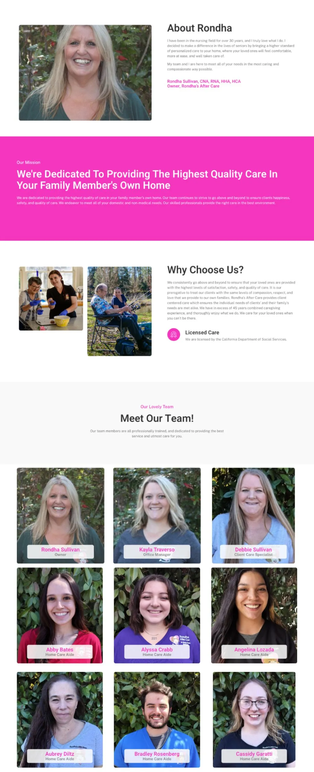
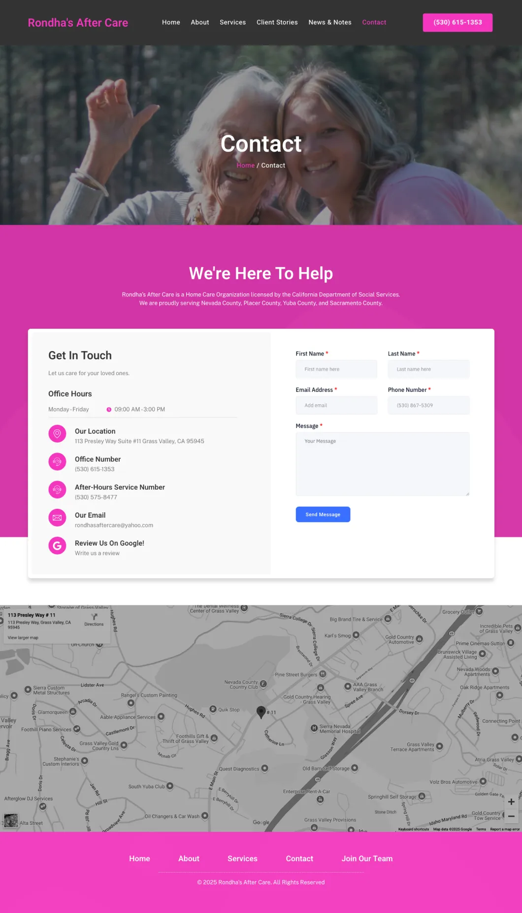
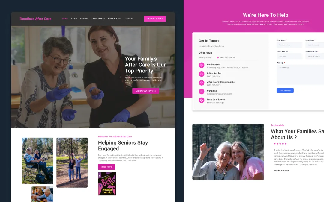
The work focused on restoring the basics that matter when a site supports real decisions: legible visual choices, dependable mobile behavior, working navigation, and clear paths to care inquiries or job applications. I rebuilt the forms so a visitor could send a message directly from the website instead of having to fall back to email or phone.
Outcome
After launch, Rhonda’s team saw a substantial increase in both applicant messages and care-related messages. That is qualitative feedback rather than a measured percentage, so I do not present it as a conversion metric.
The project is a reminder that accessibility and operational reliability are product work. For this audience, a readable interface and a form that actually submits are not polish. They determine whether someone can take the next step.